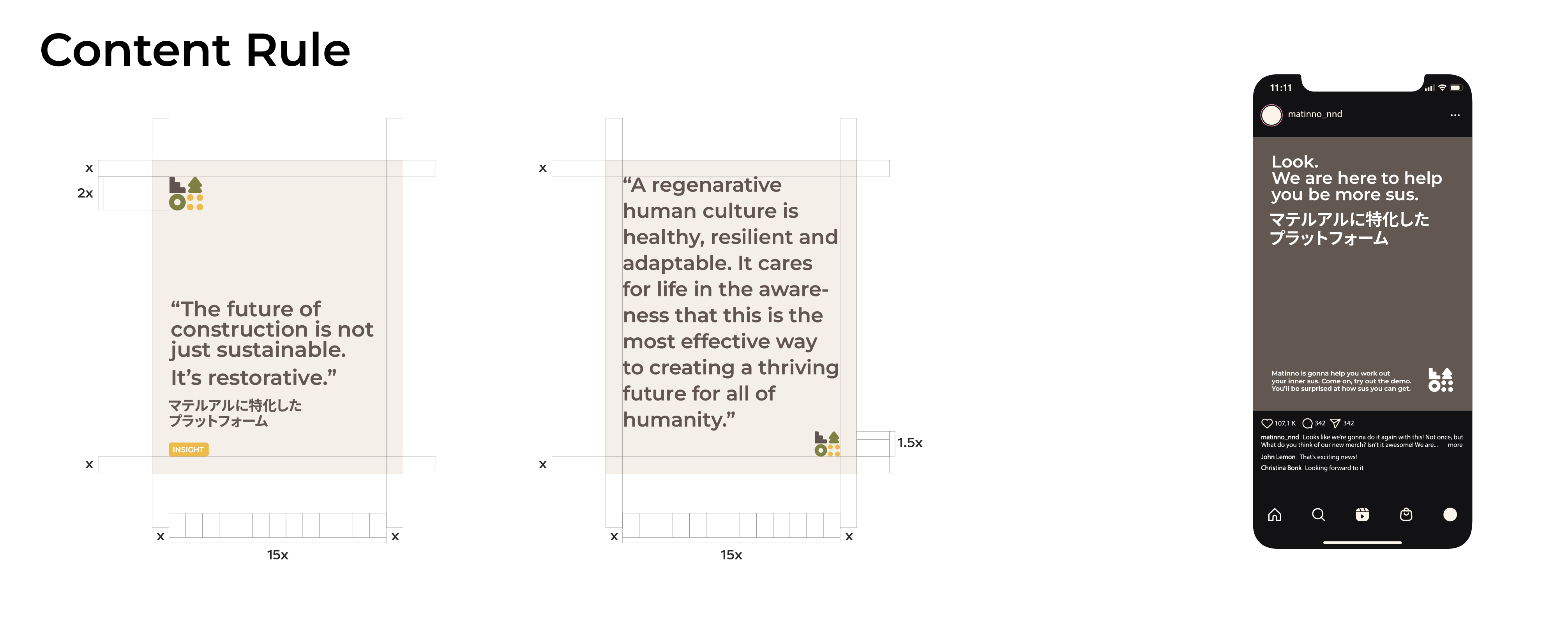
The primary challenge was designing a brand identity that appeals to two distinct target audiences—conservative Japanese companies that value tradition and structure, and young designers who seek creativity and innovation. This required balancing a professional, trustworthy aesthetic with a modern and forward-thinking approach that resonates with emerging designers. Additionally, the branding needed to establish clear typographic and layout rules to seamlessly blend both English and Japanese languages, ensuring accessibility and consistency across all materials.

I was responsible for developing Matinno’s overall brand look and feel, crafting a versatile visual system that aligns with the company’s sustainability-driven mission. Beyond creating a strong brand identity, I developed comprehensive brand guidelines, outlining typography, color systems, logo usage, and bilingual design principles to maintain cohesion across both Japanese and English communication channels.

The final branding successfully bridges the gap between tradition and innovation, offering a structured yet flexible system that speaks to both corporate entities and creative professionals. Matinno’s visual identity now provides a solid foundation for expanding its presence in the sustainable materials industry, effectively positioning the platform as a trusted and forward-thinking leader in the space.


